Report by Holly de Moissac, August 2021
QUICK SETTINGS:
For more graphic images where source file is not finely grained:
Setting: >Wood: UofA-birch666 with a 333 dpi resolution image.
Engraving: Power: 92.5, Speed: 100, Ppi: 666, Passes: 2
Cutting: Power: 100, Speed 1.2, Hz: 2000, Passes: 3
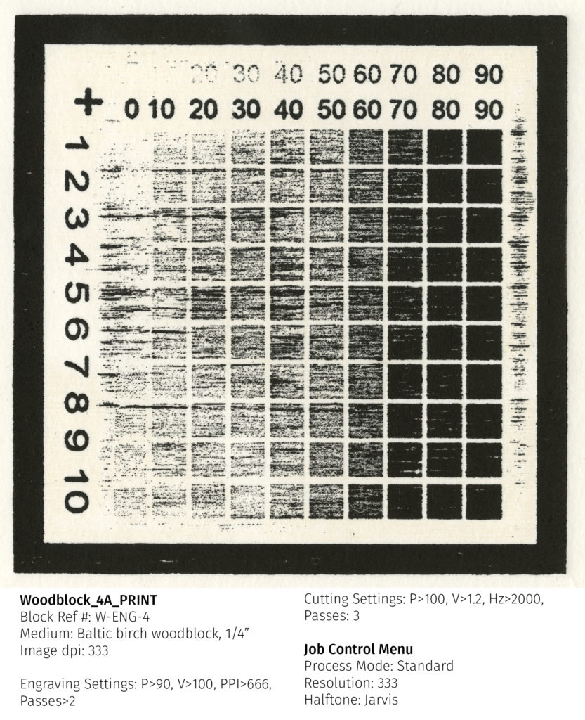
^^ use this setting for all images at 333dpi resolution.
Process options: >standard >333 >halftone: black & white
For a sensitive tonal image where a light dot structure is appropriate (photographic):
Set resolution to 250dpi.
Wood> UofAbirch-500
Engraving: Power: 92.5, Speed: 100, Ppi: 500, Passes: 2
Cutting: Power: 100, Speed 1.2, Hz: 2000, Passes: 3
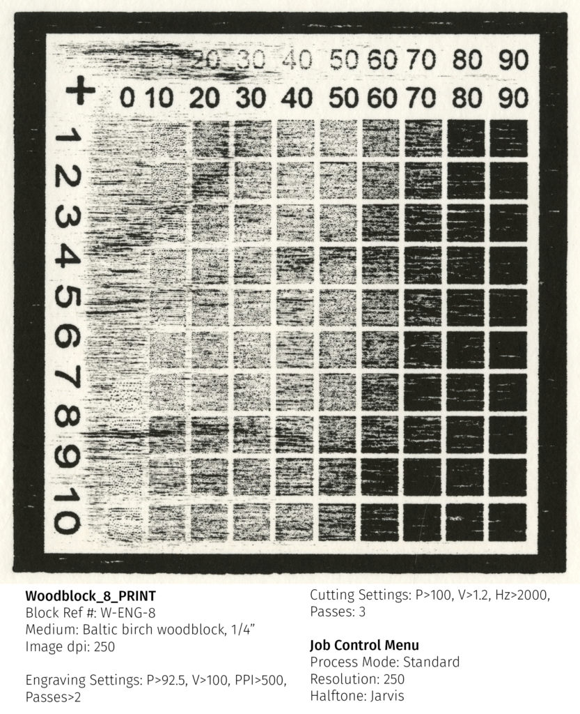
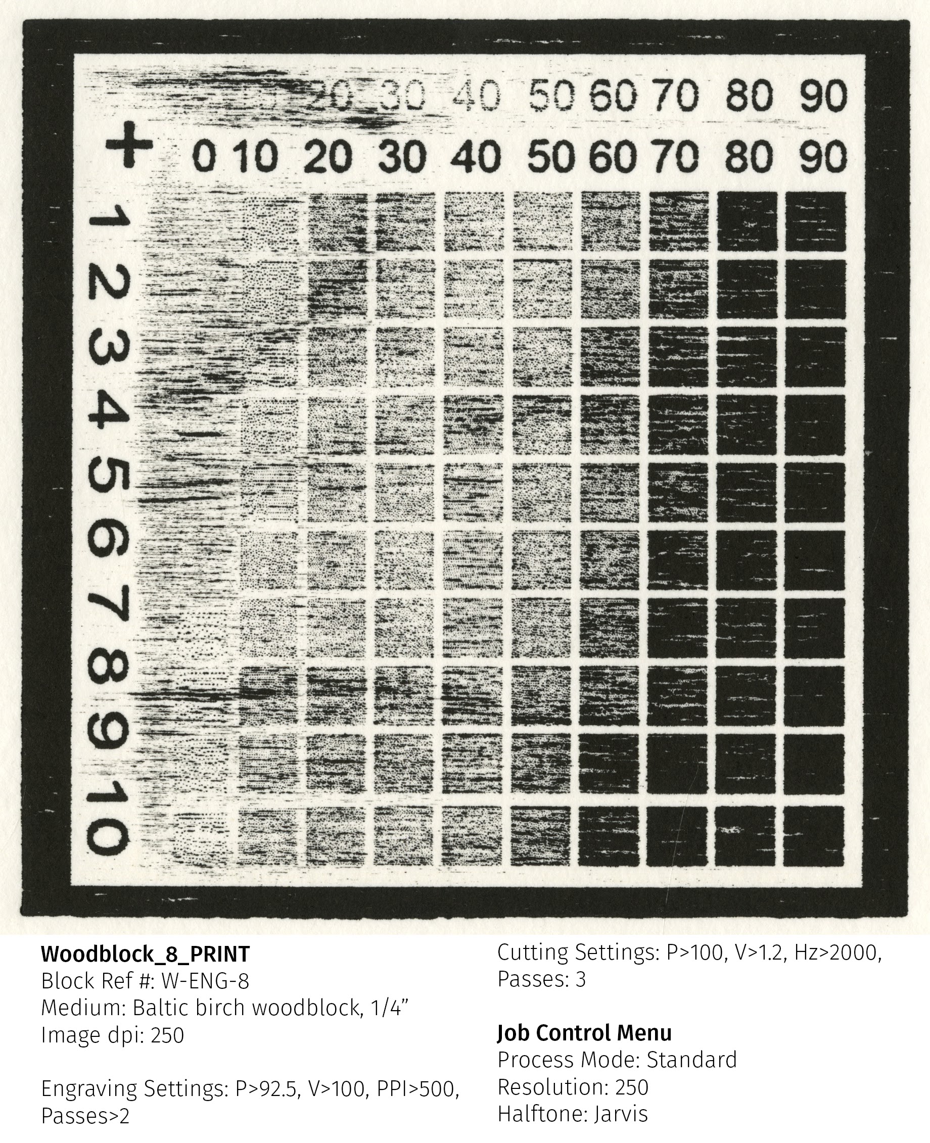
^^ use this setting for all images 125dpi, 250dpi, and 500dpi resolution.
Process options: >Standard >250 >jarvis
Note: This setting actually retains more detail than the 333dpi image in fine lines as there is more room between dots.
Detailed Report of woodcut tests
Materials
- ¼” Inch Baltic Birch plywood, selected for it’s availability and common use among students at the University of Alberta.
- Engraved and cut with a Trotec Speedy 400 laser, Images were prepared using Corel Draw/Paint software and printed through Trotec’s Job control program.
- Images were proofed on newsprint, by hand, using Sunchemical Thermofite SD Black: C229 Ink. Hand printing was done with a ball-bearing baren. A final round of printing was done on a small-bed etching press on Coventry rag paper, printed wet.
Methods
- Since Job Control has a base setting for plywood, these tests began with the Trotec plywood settings as a starting point and were then altered to achieve optimal results.
- The test images selected for the process had a focus on detail with a goal of retaining the clarity of the digital images. Imagery included digital images, linework, text, and scans of various wet and dry media.
- Proofing between tests was done by hand to generate results that would work for students printing from home during the pandemic.
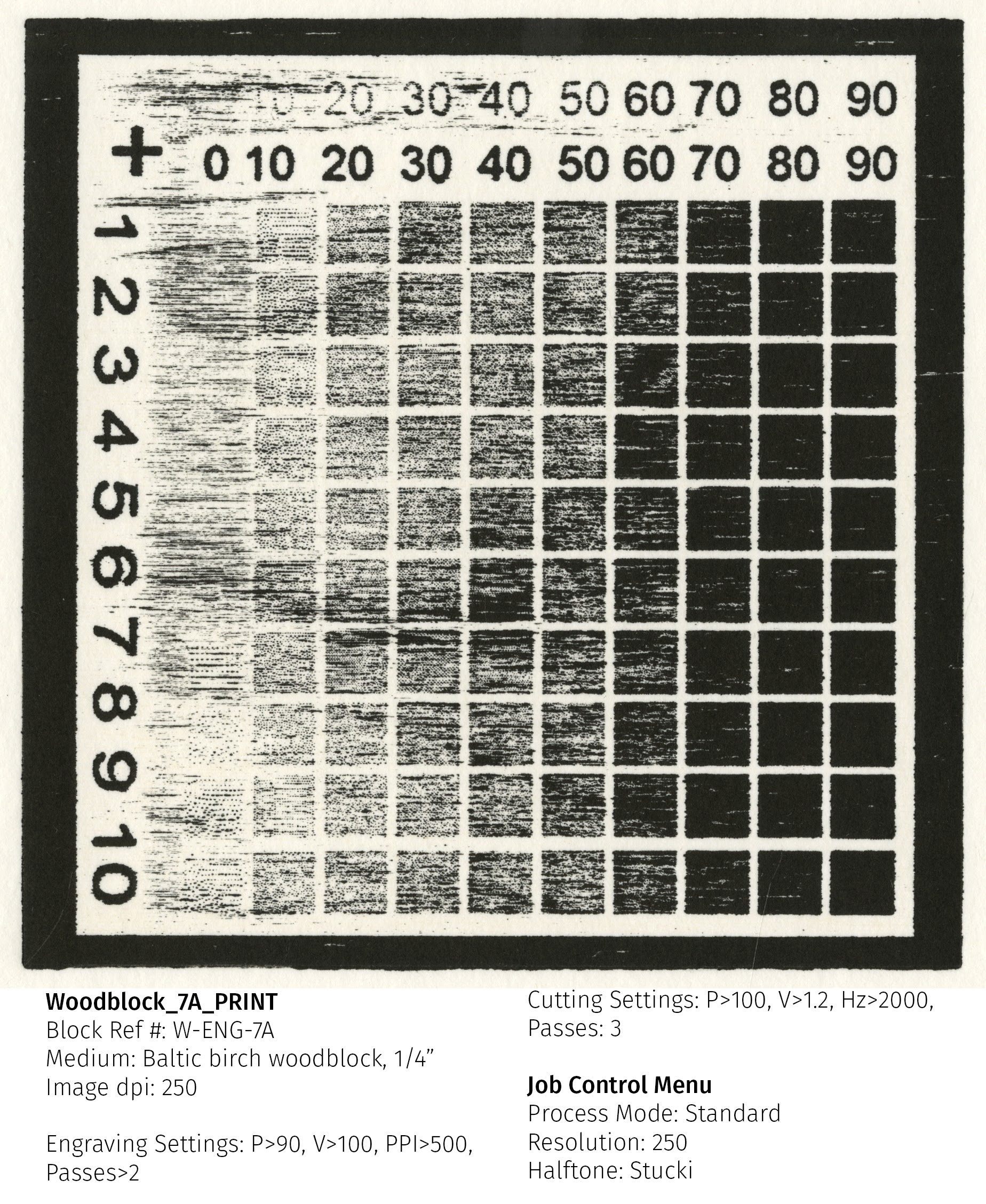
- Tests began using a grayscale tonal step test to first determine a base range of tone that engraved well into the block and to compare how the different dot patterns available through Job Control express in the medium. A priority was given to optimizing the clarity of a finely detailed image, as well as speed of cutting, since these would be primary concerns for the studio technicians.
- Early tests determined the minimum number of laser passes to allow for better rollup of ink while still keeping the time short. Since high speed was desirable, the speed setting was kept at the constant of 100 for all tests. Grayscale tests were also done at the 4 most likely used dpi levels available in the Trotec settings: 125, 250, 333, and 500.
- The power was then incrementally changed to slowly increase depth; however, tests were operated under the assumption that Trotec’s own material research would be quite accurate and that no more than a slight boost would be required.
- After arriving at a comfortable level of results with grayscale tests, the tone test was replaced with a master image to be able to provide recommendations on minimum font size, line weight, and dpi.
Images
N.B Tone tests are ~ 4 ½” x 4 ½”
Tone test at 125dpi

Tone test at 250dpi
Tone test at 333 dpi

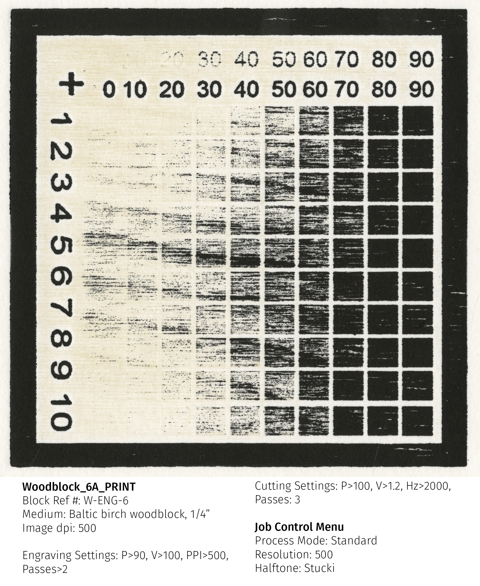
Tone test at 500 dpi
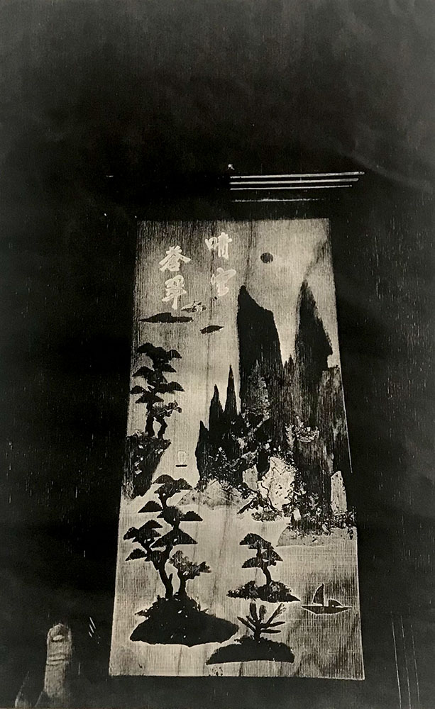
Master ImageTest, 250 dpi. 6 ½” x 7 ½”

Master ImageTest, 333 dpi. 6 ½” x 7 ½”

Conclusion
Best settings, main things learned through the tests:
First it is important to note that, in any setting, engraving ppi should be a multiple of the image dpi to keep resolution higher. In general, higher ppi is better; however, extremely high ppi settings (as in the photographic presets) can cause issues when printing large blocks (ie. if the computer being used cannot process the data fast enough or communicate with the engraver quickly enough, the machine will send an error message and need to be restarted). In the following recommendations, I have used 500 as the ppi for all images (125, 250, and 500 dpi) or 666 ppi for images using 333dpi resolution. I included this ppi setting in the labels of presets to help in selecting appropriate settings.
The two main settings generated were as follows:
Wood> UofAbirch-500
Engraving: Power: 92.5, Speed: 100, Ppi: 500, Passes: 2
Cutting: Power: 100, Speed 1.2, Hz: 2000, Passes: 3
^^ use this setting for all images 125dpi, 250dpi, and 500dpi resolution.
Wood> UofAbirch-666
Engraving: Power: 92.5, Speed: 100, Ppi: 666, Passes: 2
Cutting: Power: 100, Speed 1.2, Hz: 2000, Passes: 3
^^ use this setting for all images at 333dpi resolution.
USAGE & SETTINGS (QUICK SUMMARY)
For more graphic images where source file is not finely grained:
Setting: >Wood: UofA-birch666 with a 333 dpi resolution image
Process options:
>standard
>333
>halftone: black & white
For a sensitive tonal image where a light do structure is appropriate (photographic):
Set resolution to 250dpi.
Setting: >Wood: UofA-Birch500
Process options:
>Standard
>250
>jarvis
Note: This setting actually retains more detail than the 333dpi image in fine lines as there is more room between dots.
For tonal images that are grittier or where woodgrain is prioritized over dot structure:
Size image to 333dpi.
>Wood: UofA-Birch666
Process Options:
>Standard
>333
>jarvis
Final Notes:
For really crisp images, 500 dpi produces higher level results, particularly in images that have finely incised lines; however, this doubles the time that it takes to produce the plate. I would recommend that for high-volume undergraduate work, that images are set to 333dpi for the sake of time.
With 333dpi being the max recommended setting for most work, images should not be built with lines finer than .15-.2mm (depending on the line’s interaction with the woodgrain) and a minimum font size of 8-10 points. 10pt font will likely always work and 8pt can work but should be tested before proceeding (as a raised font, it may fill in).
Light Images:
For mostly white images with low levels of tonal information, a border should be left around the block to assist in rolling it up. It would be nearly impossible to not have scumming in a 250 dpi image that is mostly white with raised dots.
This can be minimized by tightening up the ink with magnesium carbonate and inking with a stiff roller.
Scumming picks up the wood grain and can be desirable and if used subtly.
Jarvis is the recommended dot structure for woodblock, the jarvis dot is slightly more organic than stucki and best expresses the woodgrain. The stucki dot appears slightly more mechanical and could compete with the woodgrain aesthetically, depending on the direction the block is cut.
Stucki (top) vs Jarvis (bottom)

Notes on Printing: Tightening up the ink can help with issues of filling in, especially when paired with a lean palette. Handprinting or printing without felts and a tympan yields the most consistent results since the paper is not being pushed into the open areas of the plate to pick up scum. Blocks should be printed with a collar or steps and runners and appropriate packing (ie: a layer of thin mat board would help prevent the paper being pushed into open areas on a press). Blocks printed on the press must be set with the minimum pressure required to get a good impression. As the raised dots are delicate, cleaning a block where ink has been pushed into the fine grooves of the matrix could result in breaking down the raised dots and losing information. It is best to take measures to avoid the block filling in at all.
Further research
A followup test was done on the 333 dpi image to see if a higher power value (95) would result in clearing the background information and less filling in. The results did not demonstrate clear improvement.
Printing a larger block at a later date went very well. Blocks with large open areas are still prone to scumming but printing with a collar, runners, and tympan proved very successful here. The larger block was printed on rice paper, backed with 2 sheets of newsprint and a sheet of rag paper as packing, followed by a Lexan (polycarbonate) tympan. Steps at the leading and trailing edge of the block paired with runners up the sides of the press bed resolved any issues of paper pulling and being pushed down into the engraved cavities.
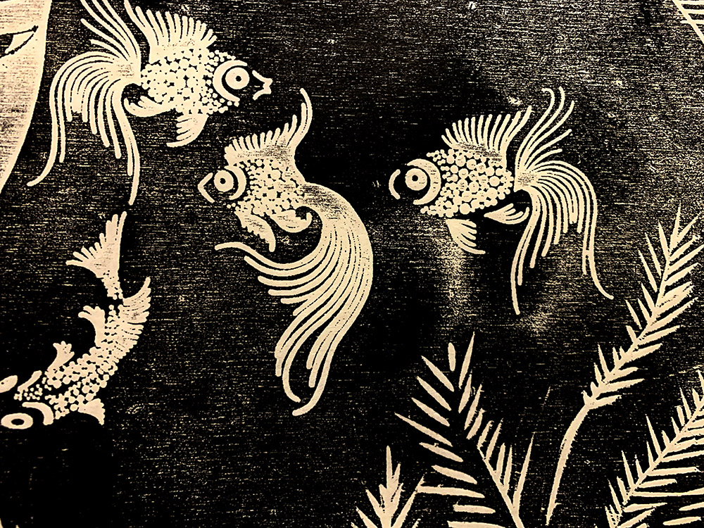
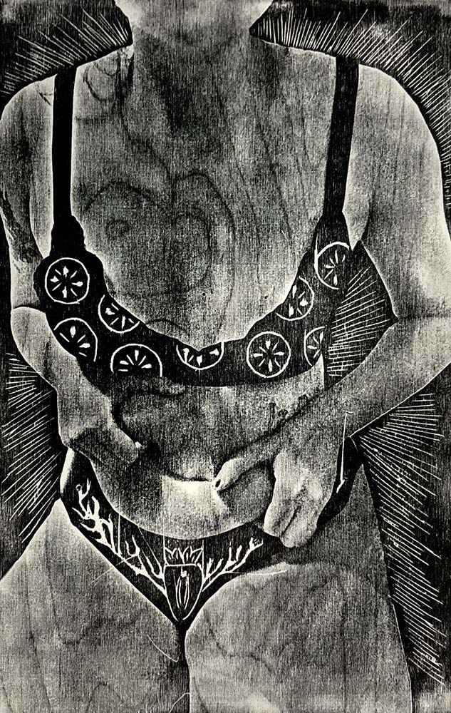
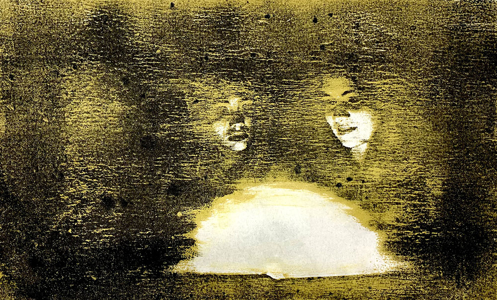
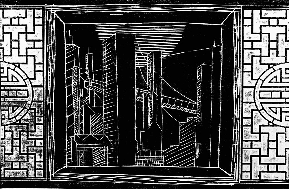
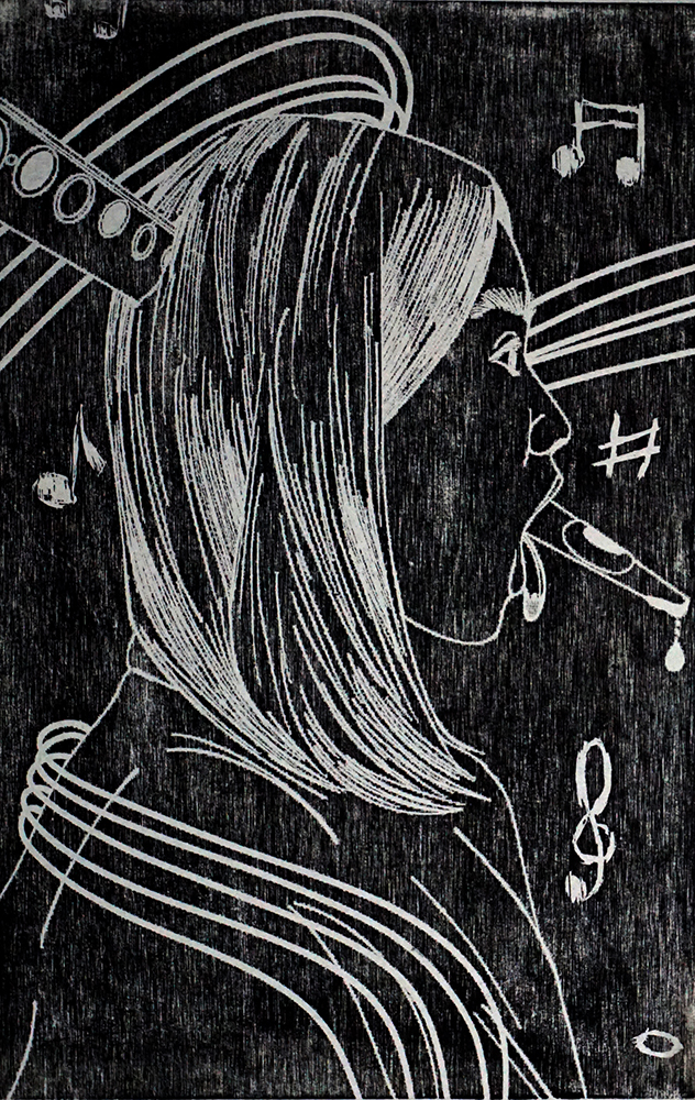
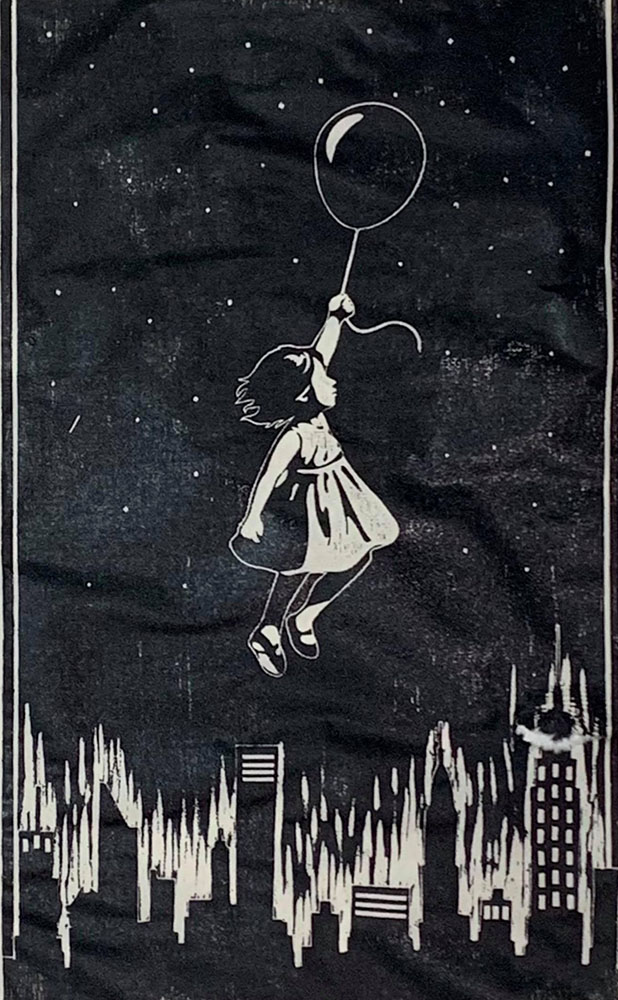
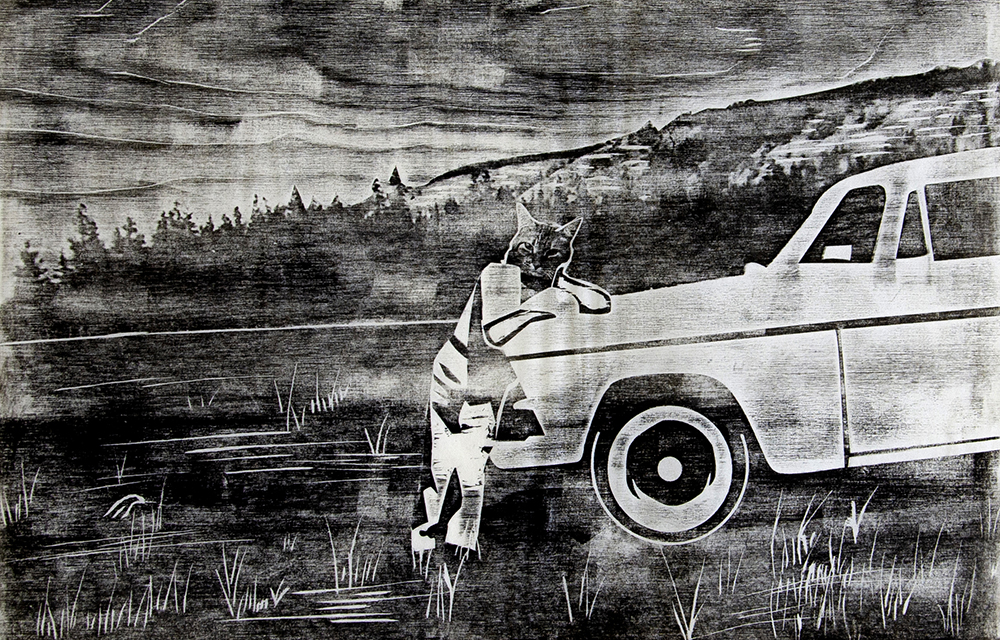
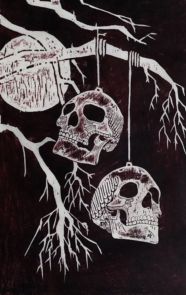
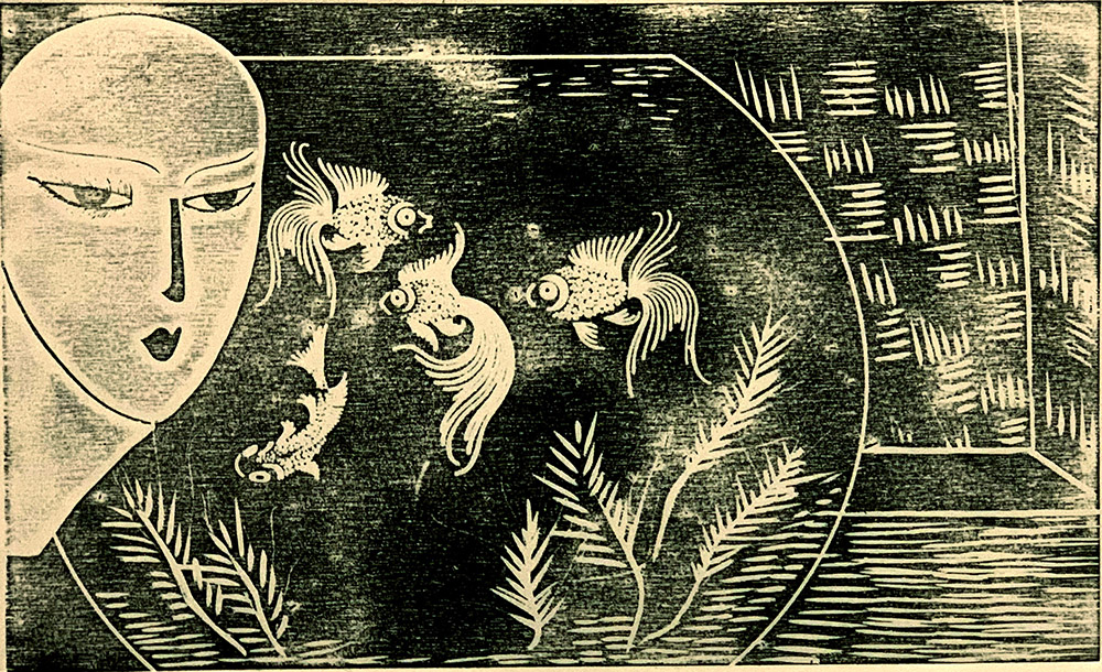
Examples of undergraduate intro projects
Examples of undergraduate introductory relief project made with laser engraving into 1/4 inch baltic birch. All digital files were saved as 333 dpi grayscale jpegs and laser engraved on the Trotec Speedy 400 with the settings: Power – 92.5, Velocity – 100, PPI – 500, 2 passes, standard process, and jarvis halftone. N.B all blocks were printed by hand using AKUA inks.