Report de Holly de Moissac, August 2021
QUICK SETTINGS:
Recommended dpi is 250 although 333 dpi could be used in some cases for effects useful to specific artist projects.
Engraving a 250 dpi Image:
Power=100, Velocity=35, PPi=750, 2 Passes
Rubber>UofABattleShipLino750

Engraving a 333 dpi Image:
Power=100, Velocity=35, PPi=666, 2 Passes
Rubber>UofABattleshipLino666
Cutting any dpi block: Power=100, Velocity=2, Hz=2000, 4 Passes
Dot structures: Jarvis or Stucki for randomized dot patterns or Ordered Dithering for a project where higher resolution is not a priority and the presence of an obvious dot structure is desired.
Notes on Printing: Blocks should be printed with a lean palette. Ink can be modified to increase stiffness to assist in printing the block without over-inking and to help prevent ink from moving into open areas.
After cutting, blocks should be gently wiped with a damp cloth (particularly the parts of the block that border cut lines) as oil from the block may leech out from these junctures and prevent ink from sticking to the block. Wiping also removes smoke residue which would likely print through transparent ink.
Detailed Report of linocutting tests
Materials
- Gray Battleship lino (⅛”) was chosen as the matrix since it is what is available to our undergraduate students through the university art store. Also, its composition of cork, oil, and jute make it a non-toxic material.
- Engraved and cut with a Trotec Speedy 400 laser, Images were prepared using Corel Draw/Paint software and printed through Trotec’s Job control program.
- Images were proofed on newsprint, by hand, using Sunchemical Thermofite SD Black: C229 Ink. Hand printing was done with a ball-bearing baren. A final round of printing was done on a small-bed etching press on Coventry rag paper, printed wet.
Methods
- When testing the lino, the rubber setting within Job Control seemed like the most useful preset to begin from since rubber is also a natural material with similar surface qualities.
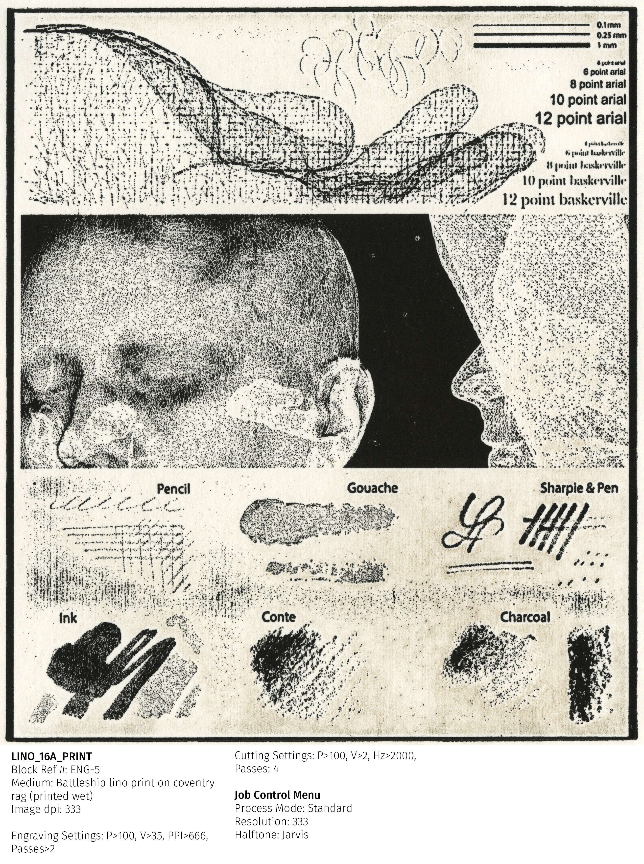
- The test images selected for the process were highly detailed in order to facilitate the goal of retaining the clarity in digital images. Imagery included photographic elements, linework, text, and scans of various wet and dry media.
- Tests began using a grayscale tonal step test to first determine a base range of tone that engraved well into the block and to compare how different dot patterns express in the medium. Priority was given to the clearest printing image with enough space between the dots to avoid issues of fill-in. Since the rubber setting begins with a power value of 100, speed was increased to lower the temperature and create a surface structure with enough variation to print clearly, space between the dots to prevent infill, and low enough heat to prevent excessive smoking and powdering of the lino.
- Early cutting tests were concerned with cutting the block free without degrading the edges. Since the battleship lino is embedded with a jute backing, it was necessary to arrive at parameters that would cut through the jute backing in the fewest passes. The final settings work in this regard, though sometimes require a few final incisions from the back side to free any excess fibres that remain attached. Since the amount/depth of the fibres is variable, the recommended settings allow for some minimal attachment to prevent excess smoking and oil-leeching, which happens when the lino is exposed to too much heat.
- Tone Tests started using a jarvis dot at 250 dpi. This dot has proved to be easily visible when comparing results and is easier to print consistently. The slightly greater space between the raised points helps the dots fill in less than a 333dpi image.
- Tests Started with the following rubber preset: P=100, V=25, PPi=500 (a multiple of 250).
- Since the initial blocks demonstrated a great deal of information loss in the lower black values (0-40%), the velocity was bumped up by 5 in consecutive tests until the dots appeared to stabilize (not being burned away by receiving too much heat and taking on a more uniform appearance). This happened at a velocity of 35. Tests were then done of the other preset PPi values for comparison: 125, 333, and 500. While 333 produced a fine dot, it was more difficult to print and prone to filling in. There is not enough space between the dots to print with reasonable consistency. Ink buildup will result in filling in over time and an error of too much ink accumulating between dots would be challenging to remove without degrading the block over time (if we follow the rule that solvent clean-up of lino blocks makes them ink-resistant and less likely to print well over time).
- The 125 dpi block: prints with great error. The laser fails to clear away narrow strands of the block in open areas resulting in an overall gray tone in the negative space that is unpredictable. This could be useful as a plant texture to work into but is not helpful for most applications.
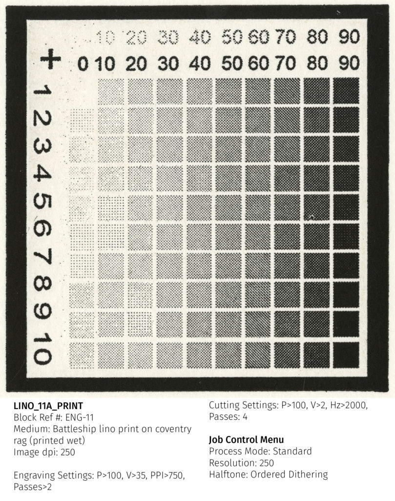
- The 250 dpi block: further refinements were made to the 250dpi settings in an effort to further clear the negative space between dots and even out the dot quality. Having arrived at a good velocity threshold, the PPi setting was increased to 750 to provide slightly more clarity.
- The 333 dpi block: uses the same settings as the 250 block with the exception of the PPi being set to 666 (a multiple of 333).
- The 500 dpi block: given the propensity of the 333 dpi block to fill in, a 500 dpi block would be extremely problematic. When engraving, the block simply powders at 500 dpi. The raised dots are too close together and flake off the surface.
- Next, after a good set of settings were established, the 125dpi, 250dpi, and 333dpi blocks were all tested with the ordered dithering dot structure available in dot control. While this form of bitmapping is very evident in the resulting image, it also has a high likelihood of printing well and provides an interesting texture that could be useful in many projects.
- Through the ordered dithering setting: 250 dpi creates the best result. THe dots are clear and precise, with a very even shape. At 333 dpi, good results could be possible; however, these dots can still fill in and will be slightly less uniform. Blocks printed with a 125 setting still have the issue of not properly clearing the negative space.
- Finally, the photographic blocks were tested with the best settings, at 250 dpi and 333 dpi using both the jarvis dot and ordered dithering halftone. The 250 dpi block consistently performs best. At 333 dpi, dots begin to fill in and fine lines break down.
Images
Tone test at 125 dpi

Tone test at 250 dpi

Tone test at 250 dpi, Ordered Dithering
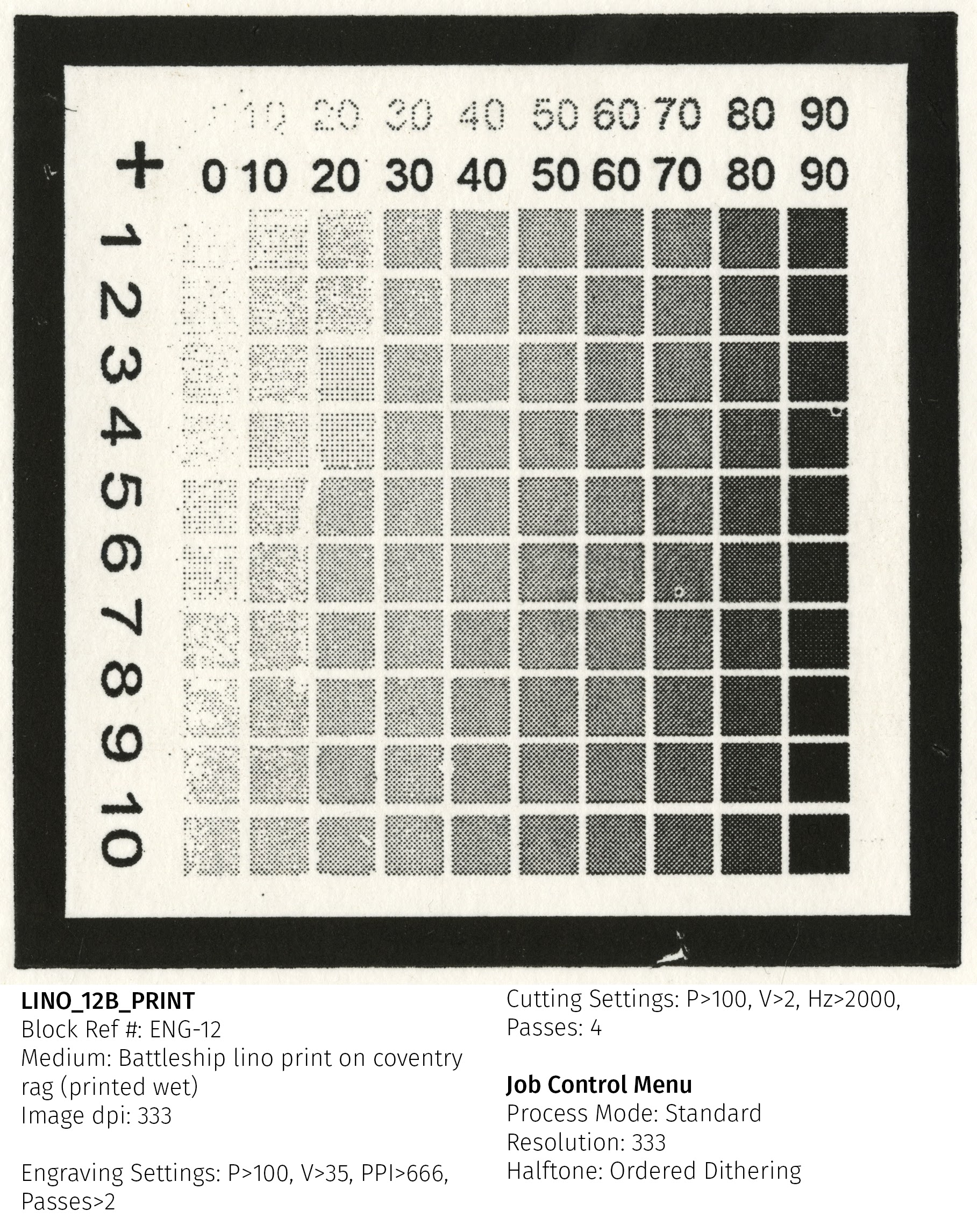
Tone test at 333dpi
Photographic test at 250dpi

Photographic test at 333dpi
Photographic test at 250dpi, Ordered Dithering

Conclusion
The battleship linoleum has a fine window of optimal settings:
Recommended dpi = 250. 333 dpi could be used in some cases for effects useful to specific artist projects.
Settings:
Engraving a 250 dpi Image:
Rubber>UofABattleShipLino750
Power=100, Velocity=35, PPi=750, 2 Passes
Engraving a 333 dpi Image:
Rubber>UofABattleshipLino666
Power=100, Velocity=35, PPi=666, 2 Passes
Cutting any dpi block: Power=100, Velocity=2, Hz=2000, 4 Passes
Dot structures: Jarvis or Stucki for randomized dot patterns or Ordered Dithering for a project where higher resolution is not a priority and the presence of an obvious dot structure is desired.
Notes on Printing:
Blocks should be printed with a lean palette. Ink can be modified to increase stiffness to assist in printing the block without over-inking and to help prevent ink from moving into open areas.
After cutting, blocks should be gently wiped with a damp cloth (particularly the parts of the block that border cut lines) as oil from the block may leech out from these junctures and prevent ink from sticking to the block. Wiping also removes smoke residue which would likely print through transparent ink.